|
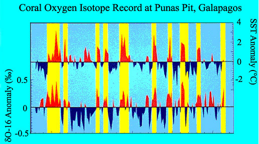
| Paleotemperatures derived from examinations of coral reefs from the Galįpagos Islands off the coast of Ecuador. The upper graph shows the Sea Surface Temperature (SST) Anomaly. Red indicates warmer than average temperatures, while blue indicates colder than average. The lower graph shows the oxygen isotope anomaly, a proxy for paleotemperature. The yellow bars indicate El Niño years – note how they correlate very well to the Pacific coral record of warming. (Data from Shen et al. and graph modified from NOAA at National Geophysical Data Center ). |