|
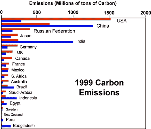
| Emission expected for average C burning (blue) and emissions actually reported (orange) for the 20 top emitters. Orange bar exceeds length of blue bar: high per capita emission (e.g., USA). Blue bar > orange bar: low per capita emission (e.g., Bangladesh). |